TOAD by Tyson 2.0
BRANDING・ART DIRECTION・graphic design・brand guidelines・ILLUSTRATION
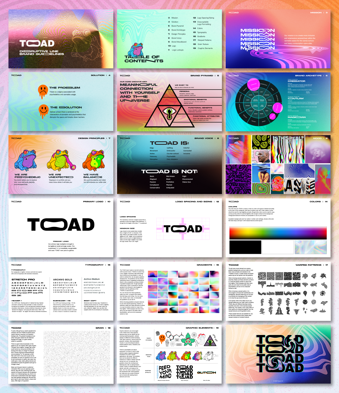
CHALLENGE・Differentiate the TOAD product line from Tyson 2.0 while maintaining a sense of cohesiveness between the two. Initially, the TOAD line lacked distinctiveness and needed a creative transformation to reflect Mike Tyson's psychedelic experiences. While these lines were meant to be distinct, there was a need for consumers to recognize their brand connection.
SOLUTION・I strategically introduced subtle, gritty psychedelia aesthetics into the main Tyson 2.0 line during its brand refresh, which provided room to explore a more trippy creative direction for TOAD. Cohesiveness was achieved by incorporating grunge textures, warped patterns into both brands, black color and similar typography into both brands, while building differentiation using neon colors and stretched accent letters for TOAD.
RESULTS・The resulting TOAD subline achieved a balance of cohesion with the Tyson 2.0 main line while establishing its unique identity. It stood out prominently in a competitive market landscape, enhancing overall brand recognition for Tyson 2.0. Furthermore, the versatile design guidelines leave ample room for expansion into additional products and varieties, offering future growth opportunities.


