Tyson 2.0
BRANDING・ART DIRECTION・graphic design・brand guidelines
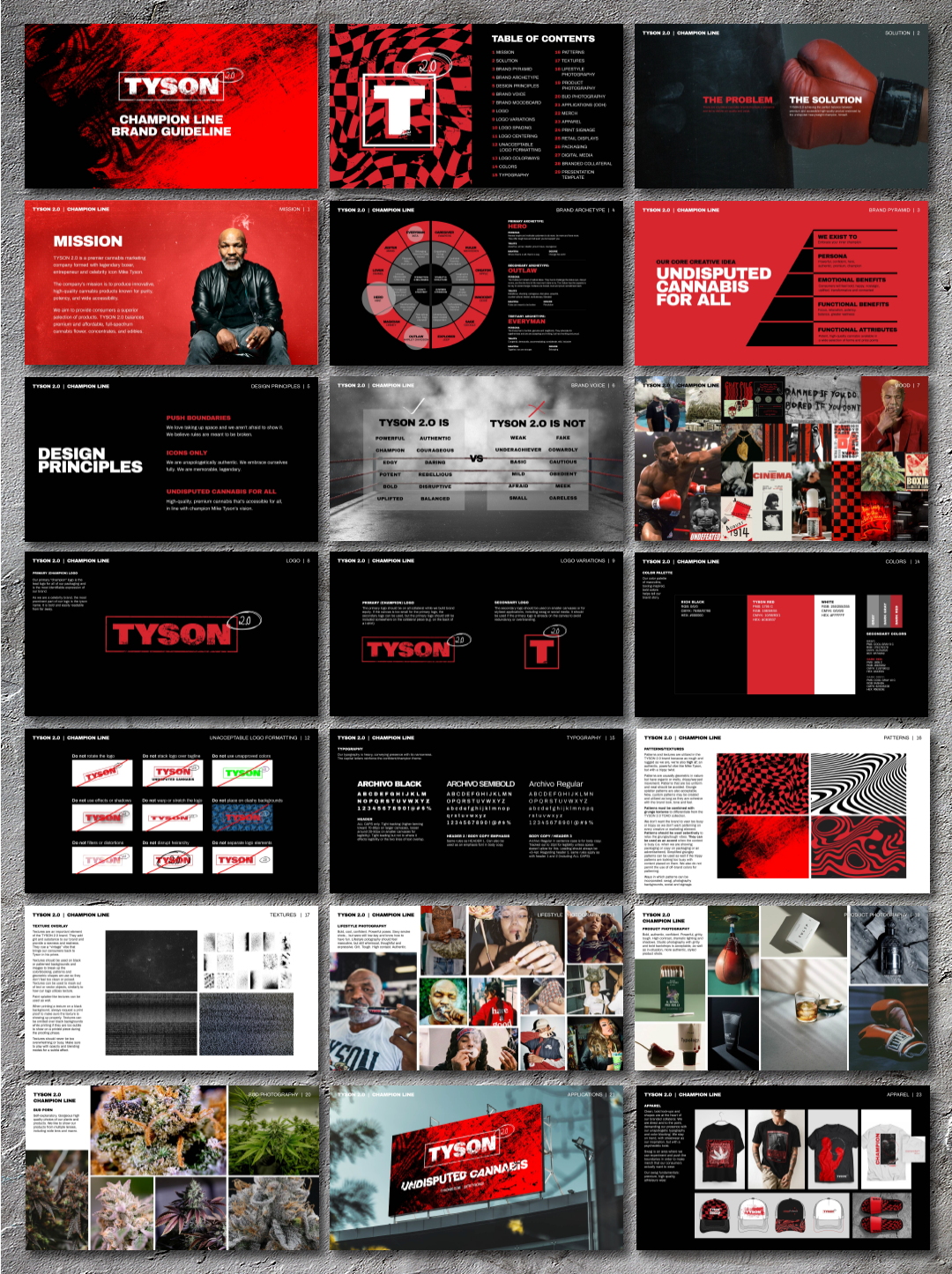
CHALLENGE・Refining the Tyson 2.0 visual identity from its athletic, boxing-focus to a nuanced, cannabis-oriented brand, blending the raw intensity of Mike Tyson's persona with a touch of psychedelia, which required updated art direction, refreshed brand messaging, and a comprehensive brand guideline.
SOLUTION・In collaboration with the Tyson 2.0 team, we strategically refined Tyson 2.0, evolving it into a distinct cannabis brand that retained Tyson's authentic intensity while incorporating subtle psychedelic elements. I established a comprehensive set of guidelines, covering typography, photography, and all branded materials, ensuring consistent and precise brand representation.
RESULTS・Tyson 2.0 has made significant strides, including MedMen and Planet 13 Las Vegas store takeovers, expanded social media reach, continued national expansion, and international growth into Australia, Canada, and Amsterdam. The focused brand identity has helped Tyson 2.0 become a recognized name in the cannabis industry.
Photo by Toobs Distribution


